

Breathe Freely
Ninaplaastrid
 Taskukohane hind
 Tasuta saatmine
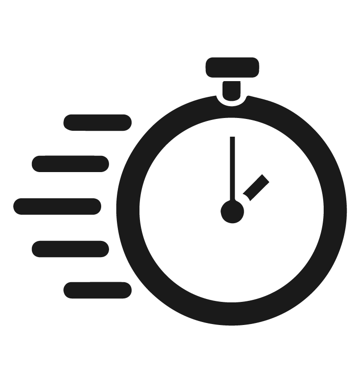 Kiire transport


MIKS ON SUUHINGAMINE HALB?

ÜTLE EI -
HALVALE UNELE
STRESSILE
FOOKUSE PUUDUMISELE
MADALALE ENERGIALE
KEHVALE SOORITUSELE TRENNIS
Miks kasutada Hinga Vabalt ninaplaastreid?

Suurenenud hapnikutarbimine
Norskamise vähenemine või kadumine
Parem sportlik sooritusvõime
Ülemiste hingamisteede ja limaskestade parem tervis
Vähenenud stressitase ja suukuivus
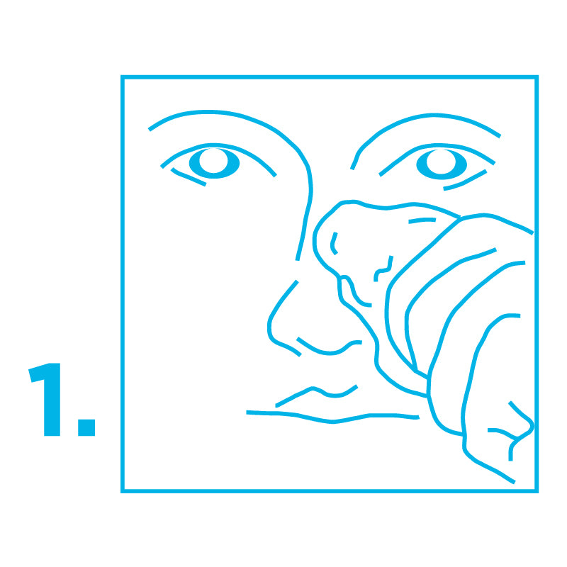
Kuidas ninaplaastreid kasutada?


Oluline teada
Mitte katsuda liimiriba! Enne kasutamist puhastada ninanahk rasust. Kui nahk on pärast plaastri kasutamist kuiv, siis kasutada niisutavat kreemi. Tundliku naha korral määrida plaastri keskosa kreemiga nii, et ninale kleepuksid ainult plaastri otsad. Enne füüsilist tegevust asetada plaaster ninale 30 minutit varem. Toode on mõeldud välispidiseks ja ühekordseks kasutamiseks.
Tähelepanu!
Mitte kasutada nahavigastuste, ärrituste, allergia, allergilise reaktsiooni ega päikesepõletuse korral. Mitte kasutada üle 12 tunni päevas ega alla 5-aastastel lastel. Toode ja/või toote pakend võib põhjustada allergilist reaktsiooni. Nahaärrituse tekkimisel lõpetada kasutamine.
Ninaplaastreid ei tohi kasutada alla 5-aastastel lastel ja üle 12 tunni päevas!